1) Explain the art criticism process.The art criticism process is summed up into 4 categories. Describe, Analyze, Interpret, and Judge. Describing consists of telling what you see, listing how you would describe it over the phone to someone who can't see the piece in real life, telling the colors that were used, and explaining the elements. This helps the person you are describing it to get a clear image. Analyzing consists of telling the elements of art and the principles of design that were used. This is like listing the color, value, line, shape/form, texture, space, balance, emphasis, harmony, variety, movement, proportion, and pattern. Interpret is like trying to figure out what the artist was trying to portray in the piece. By looking at the piece, you can try to figure out things like what the mood is, what feeling and ideas there are. And what the story being told is. This promotes a deeper meaning of the art and allows you to look at it as if it was a story being told, not just some elements put together. 2) Critique a piece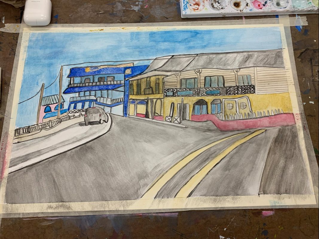 This piece is a town that consists of three detailed buildings and a roadway with a car driving into the town. The colors that are used are calm and pastel and are different shades yellow, blue, red, pink, gray, and brown. It is painted with watercolor and the texture of the image is smooth wit all of the strokes that are painted going the same way. It is a perspective piece and the proportions work well with the building that is farthest away is tiny. The building that is second farthest is second biggest, and the building that is closest is the biggest. The lines are not sharp or bold, yet contribute to shaping the overall image. The mood of this image is happy and hopeful. The sky is bright blue and the picture looks as if it was taken on a warm beautiful day. The story being told looks to be a busy tropical town. Most local towns are not different pastel colors as you only see that a lot of the times in other warmer countries which is why I said it was tropical. The car driving shows that people go to the town and the many doors and windows in each building makes the image look more realistic. I thought that the artwork turned out really well. At first I was worried because the reference picture was so detailed and the image was very hard to draw. But after a few tries I got it down. I think that the color choice I used worked very well with the image because the pastel watercolor paint is calm and easy to look at. It's not too harsh. I think that the image is also successful because it looks realistic and it is easy to tell what was painted. - Sketchbook: pick any warm-up from your sketchbook that you found beneficial, interesting or simply felt you handled well. Describe the activity and reason for selecting it above the others. Include a photo.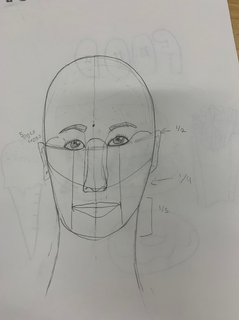 I found the face proportions warm up very beneficial and interesting. This is because I never truly learned how to draw a face and drawing this for the first time helped me realize how to make a face look realistic. I was also a little surprised when I drew the face proportions because I never knew how proportional the face really was, like the five eyes across, etc. I selected this one above the others because although the other warm ups were helpful, this one i am going to remember and also look back on every time I am drawing a person/face. - What was your favorite material that you used this year? Why do you like working with it? My favorite material that I worked with this year was acrylic paint. This is because when you messed up, you could simply paint over it. I mess up a lot while painting so this was helpful for me. I also like the texture of the paint. It is very thick and easy to paint something to it's full volume. It is also easy to mix colors. Mixing colors is a huge part of painting and i'm glad that acrylic paint allows me to do that. - What did you find most difficult about this class? This could be anything from gathering materials, to generating projects ideas, to applying a particular technique. What could be done to resolve this issue in the future?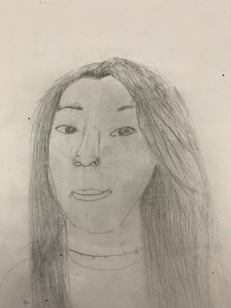 What I found most difficult about this class was making things look realistic. The picture I included was of my portrait piece because this piece is what I struggled the most on making look realistic. This is my first year of doing art, so a lot of my pieces look very beginner and a little rough, however I just want for them to look real. And I need to understand that that still is going to take a bit of time and practice to figure out. In my portrait piece, I redid the whole piece 3 times, and I redid different parts on the face too many times to count. However with practice I am proud of the way that it turned out. That is what I will use to to resolve this issue in the future. I am going to practice many times and try my best.
0 Comments
Photo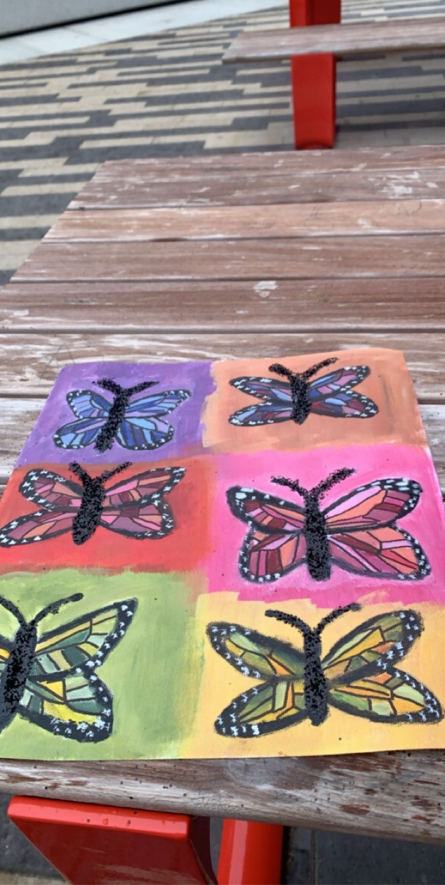 prosWhat went well about this was the wings on the butterfly. I was nervous about this part because it needed to be very detailed but I thing it overall looks good and I like the way I added different shades of different colors in the wings. I also like the white dots I added to the outside of the butterfly and I feel like it adds a realistic touch. consAlthough I overall like the image, I do wish that I made the background boxes a little more even because some of them are much smaller than others. I also wish that I made the antennas of the butterfly more thin so it would be more realistic.
Photo of finished piece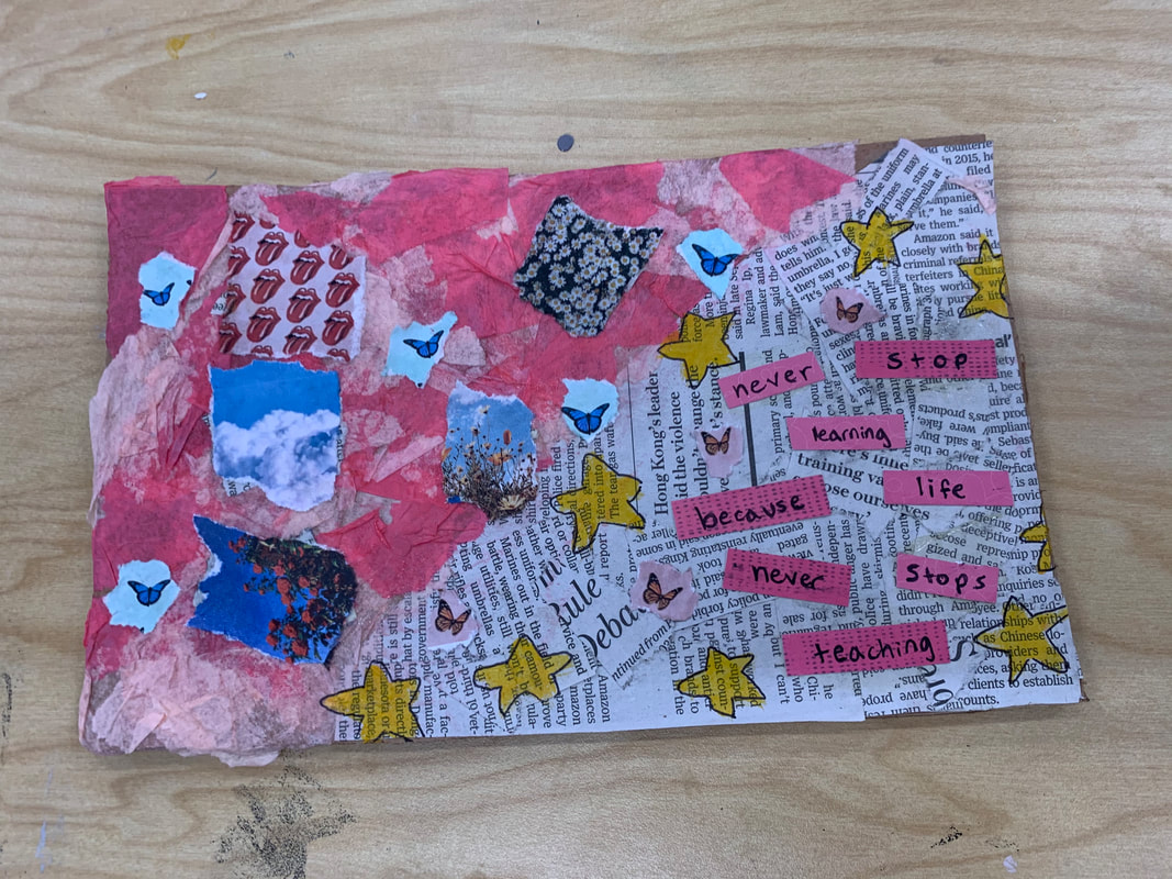 detailed Shot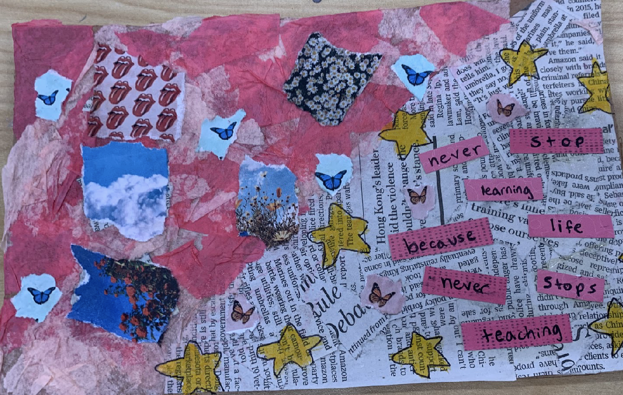 What mediums I used
My wordThe word I had was 'teach' the way that I portrayed this word was using a quote that said "never stop learning, because life never stops teaching." I like this quote a lot and I thought that it related to my word perfectly and looked well with my piece too.
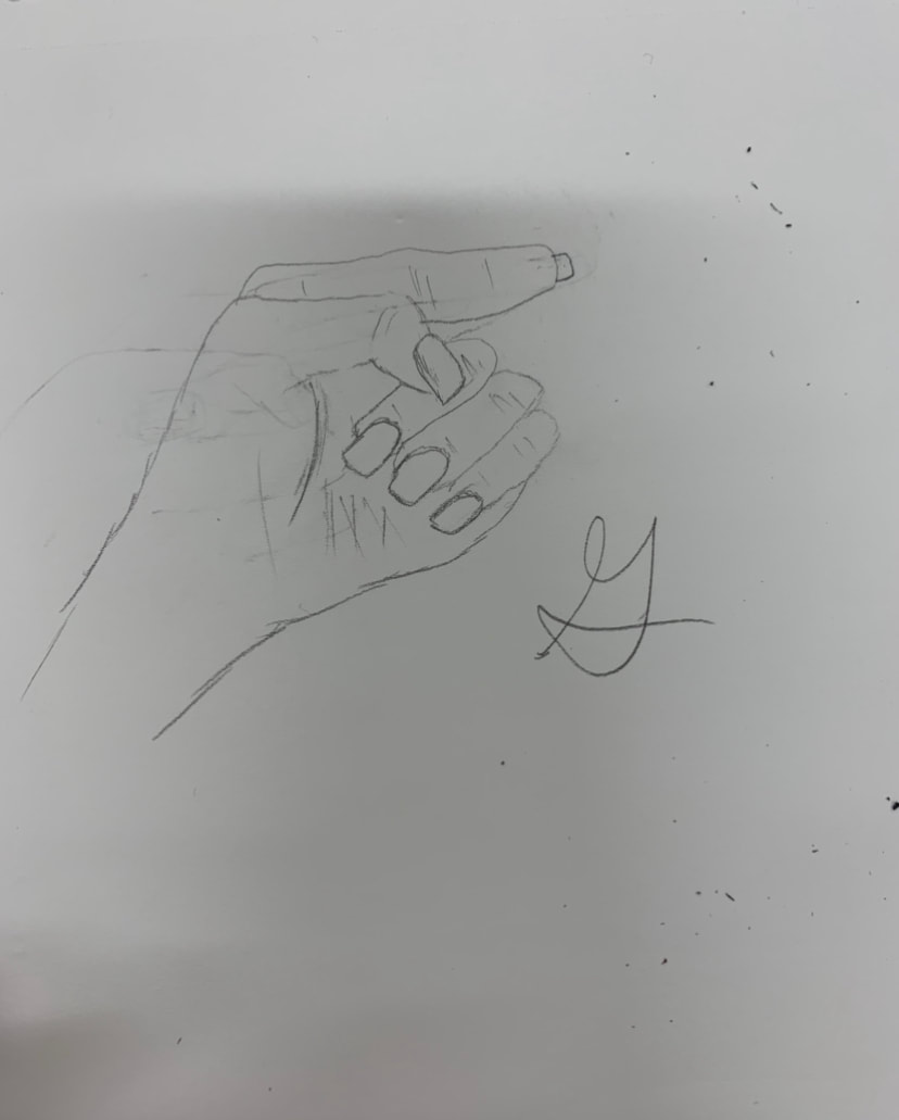
photo of piece in progress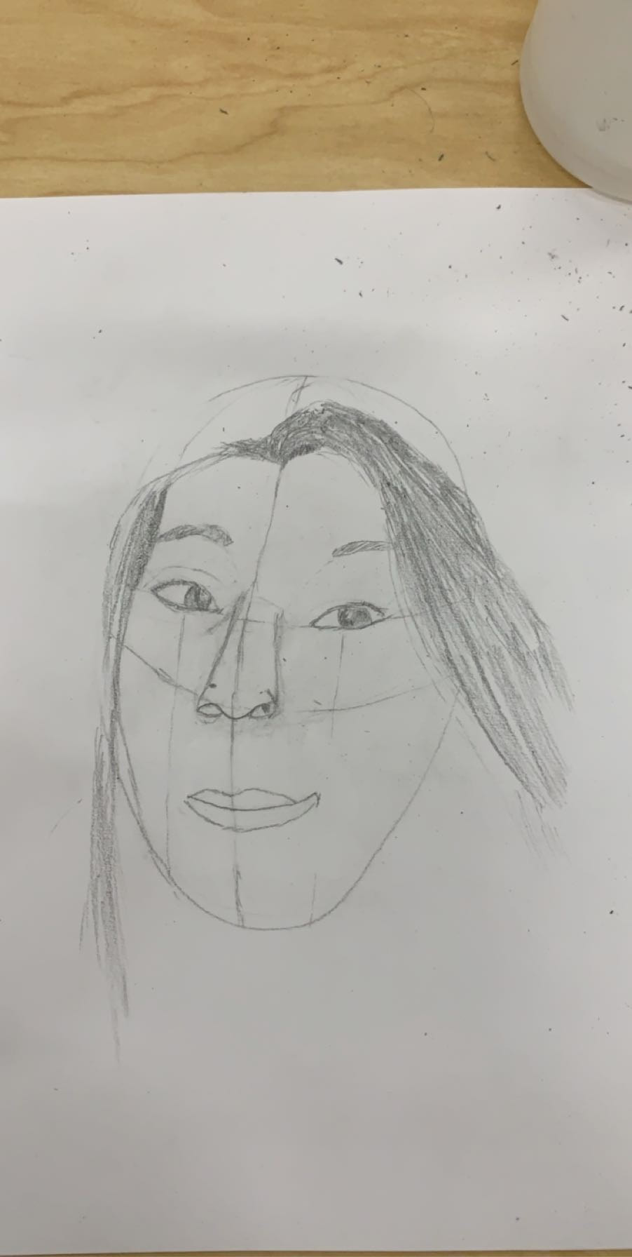 photo of finished piece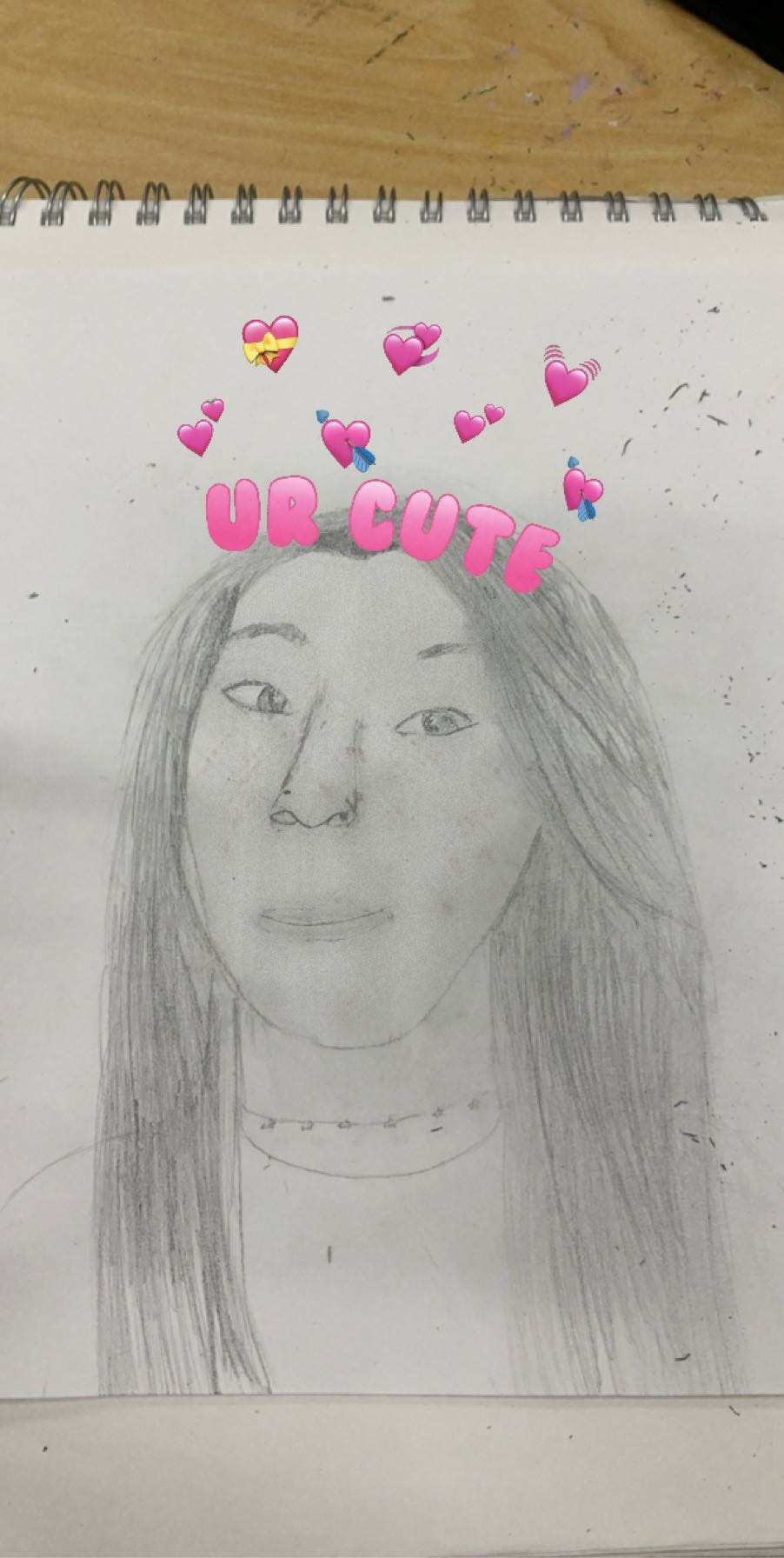 Who i did a portrait ofI did a portrait of my little sister. She is in the 6th grade. what medium I usedI used pencil drawing. It was a little bit difficult because of how detailed the shading and everything needed to be, however, I am proud of how it has turned out. my processI started off the drawing by using the face proportions warm up that we completed in class. It was difficult because in the picture I was referencing, my sisters head was turned to the side and the facial proportions warmup was very straight on so I had to adjust. After I had completed the eyes, nose, and eyebrows, I needed to do her lips. This was by far the hardest part because if the lips weren't accurate the picture did not look right. Finally, after many tries I got them right and then finished with the hair. What i find successfulWhat I find successful about this piece is the nose. This is because my sister has a very distinct nose and I feel as though I completed it very well in the picture. However, If I were to do this piece again I would probably redo the eyes because I feel as though they are a bit too squinted and a little lopsided.
photos of piece finished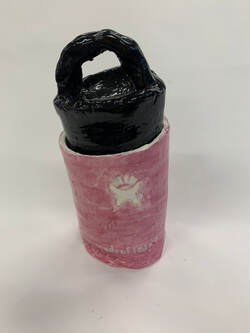 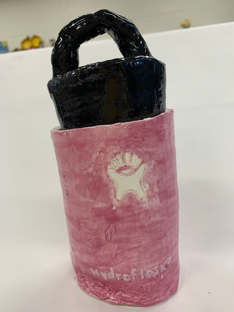 progressSince completing my last blog post, my progress has been glazing and firing in the kiln. I went through with my plan for colors and painted the body purple and the lid black. I then painted a white logo in the middle of the bottle and the words at the bottom. what i find successfulWhat I find successful about my piece is the way the cap fits, and the logo. The cap fits inside the bottle so well and just like a hydroflask cap would fit in real life. The logo is another thing I like because it was very difficult to paint and I wasn't expecting it to turn out as well as it did. What i would changeAlthough I do find my piece very successful, something that I would have changed is the bottom. I wish the bottom of my piece was flat but it has a divot and it is something that I should have fixed earlier while sculpting.
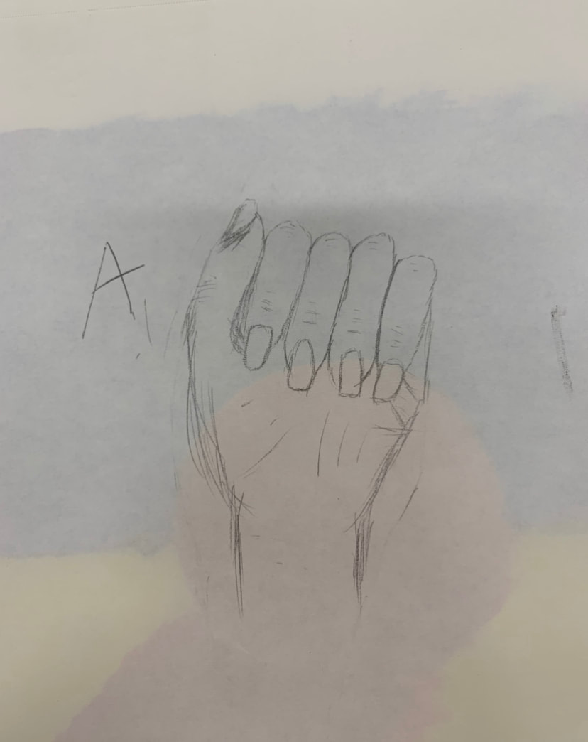
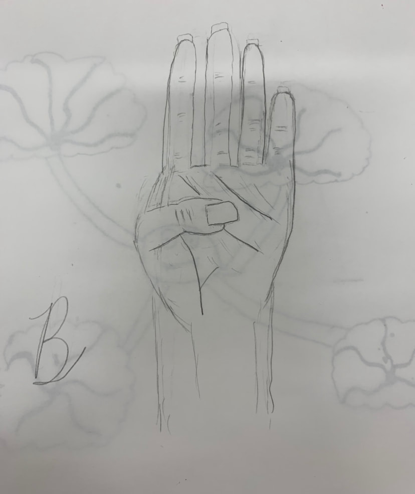
eye nose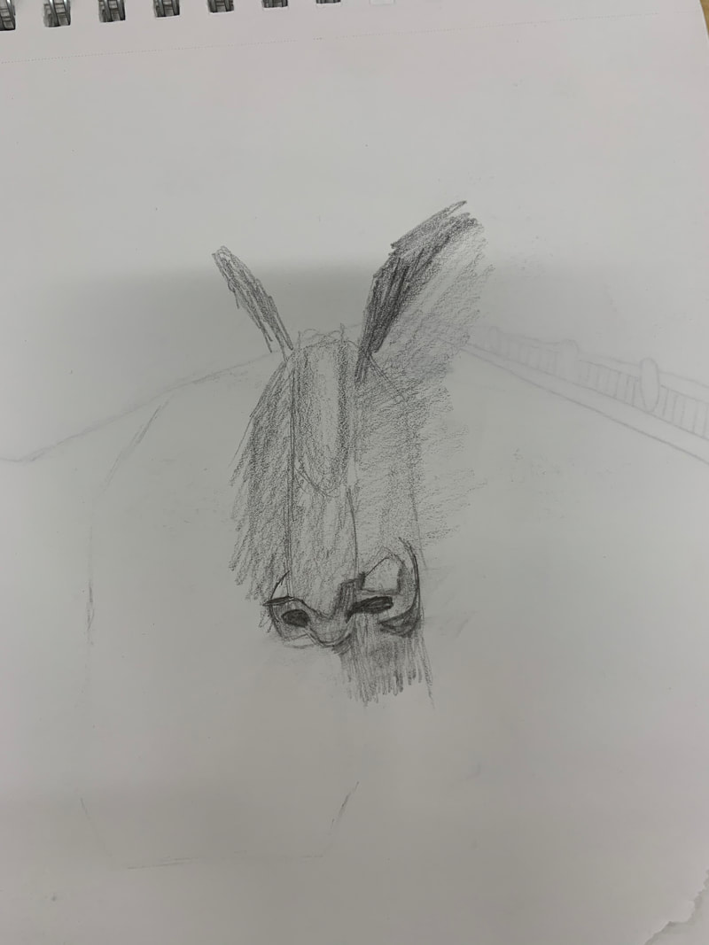 face proportions blind contour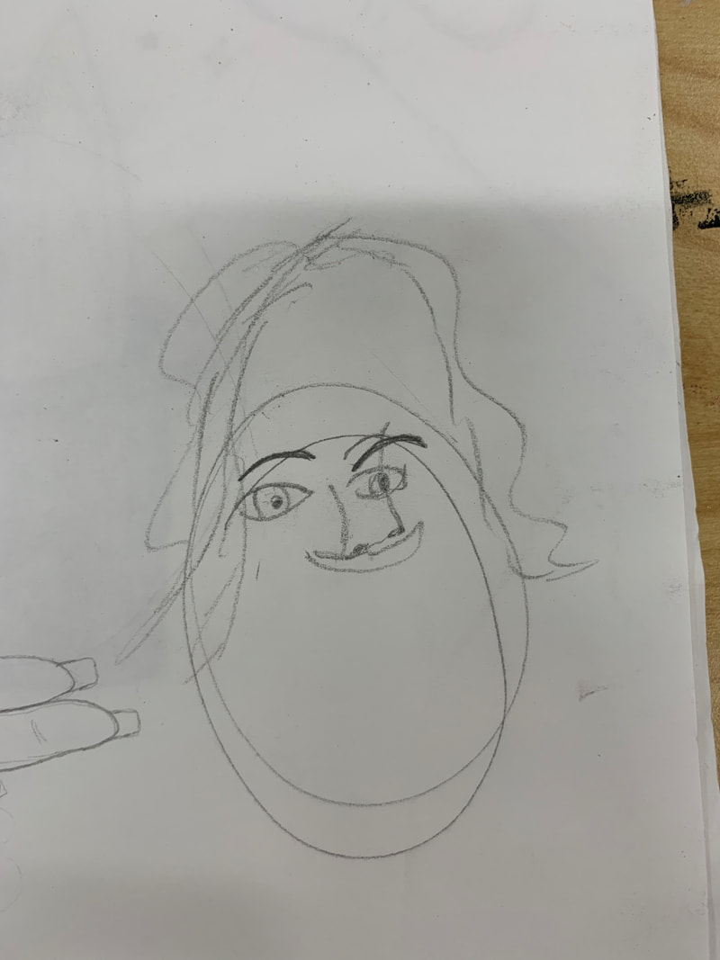 ear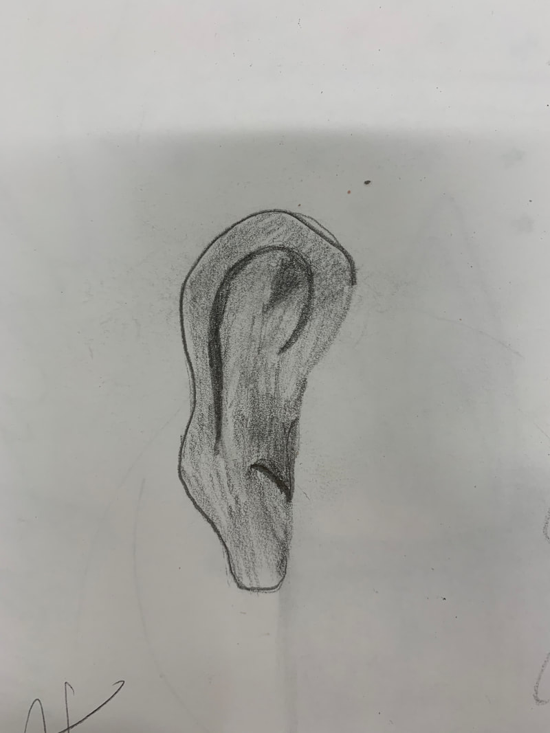 mouth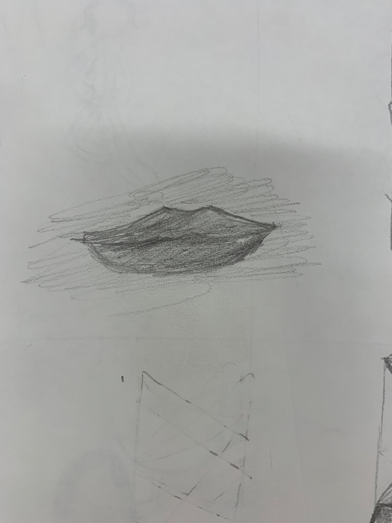 hair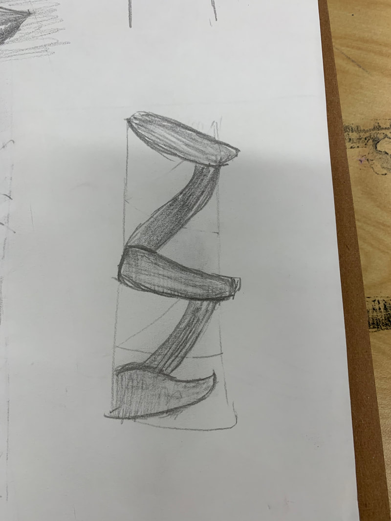 gesture drawings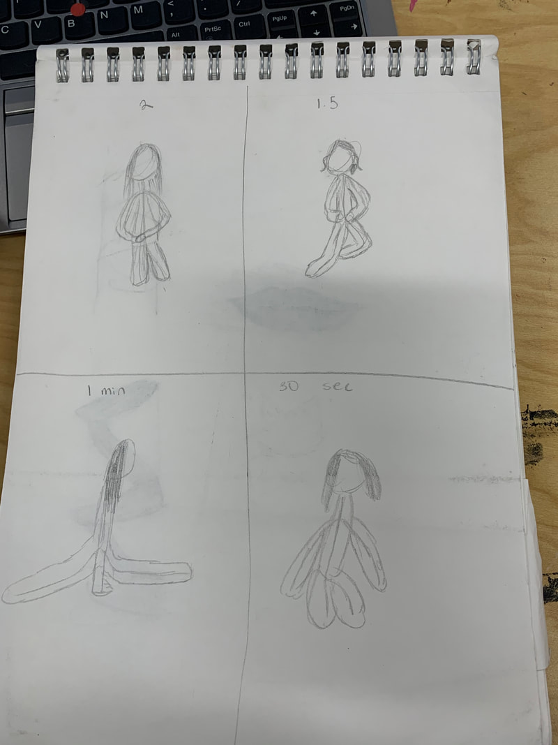 skeleton drawing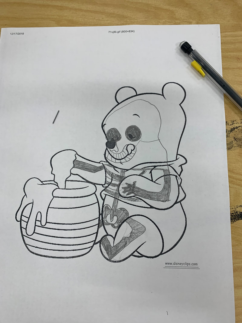 most helpful warmupThe warmup that is proving to be the most helpful in my piece so far is the eye warmup. This is because I plan to make the eye a very big part of my piece as i'm doing mixed media, and knowing how to draw and eye properly is so very helpful and will allow my piece to look much better. interesting about face proportionsThe thing that I found the most interesting about the face proportions is how you have about 5 eyes measured across your face and when you sketch that part out, it makes the position of the eyes very easy and allows it to come out natural.
what i plan to do with my pieceI plan to paint my piece a mauve color, paint the logo white, and paint the top of the water bottle black. These colors are based off of a water bottle I have seen and I hope that the colors are able to make it as realistic as possible. I also plan to outline the writing at the bottom of the bottle in black so that the brand of the water bottle is noticeable. what i found difficultWhat I have found difficult about my piece so ar was making the size just right. At first, the lid on the top was too big and would not be able to be fired without it expanding and not being able to come out. The way I fixed this was by taking a fettling knife and shaving off all of the excess parts. This made the piece skinnier and the cab able to fit. what i found successfulWhat I have found successful so far is the way I made the water bottle realistic looking to a real one. I like the way the logo turned out and the way the cap fits is the same way it fits in reality for a real water bottle. my processI started off with the clay as a slab and rolled it around a model to get the correct height and width I wanted. I let that sit over night and took the clay off the model and began on making the lid. To make the lid I used a thinner model so that it would be able to fit inside the piece I already had. I then took the lid off it's model and closed it up as well as made a holding bar on the top. I then added the hydro flask logo and put it in the kiln to be fired. photo of my piece unfinished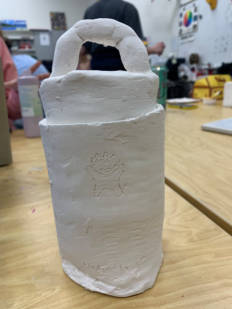 how my piece shows off lineMy piece shows off line because of the petals, I purposefully made the petals on the sunflowers big so I would be able to fit lines in there. I feel as this adds a unique amount of detail and there is also lines in the background. how my piece is successfulMy piece is successful because the flowers look realistic yet also unique and that is the exact concept I was going for. However, there are a lot of lines in the background and overall I like the piece but if I were to do it again I would have made extra work to cut out the lines in the back round of my piece. Photo of sketch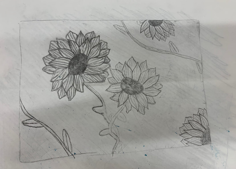 photo of best piece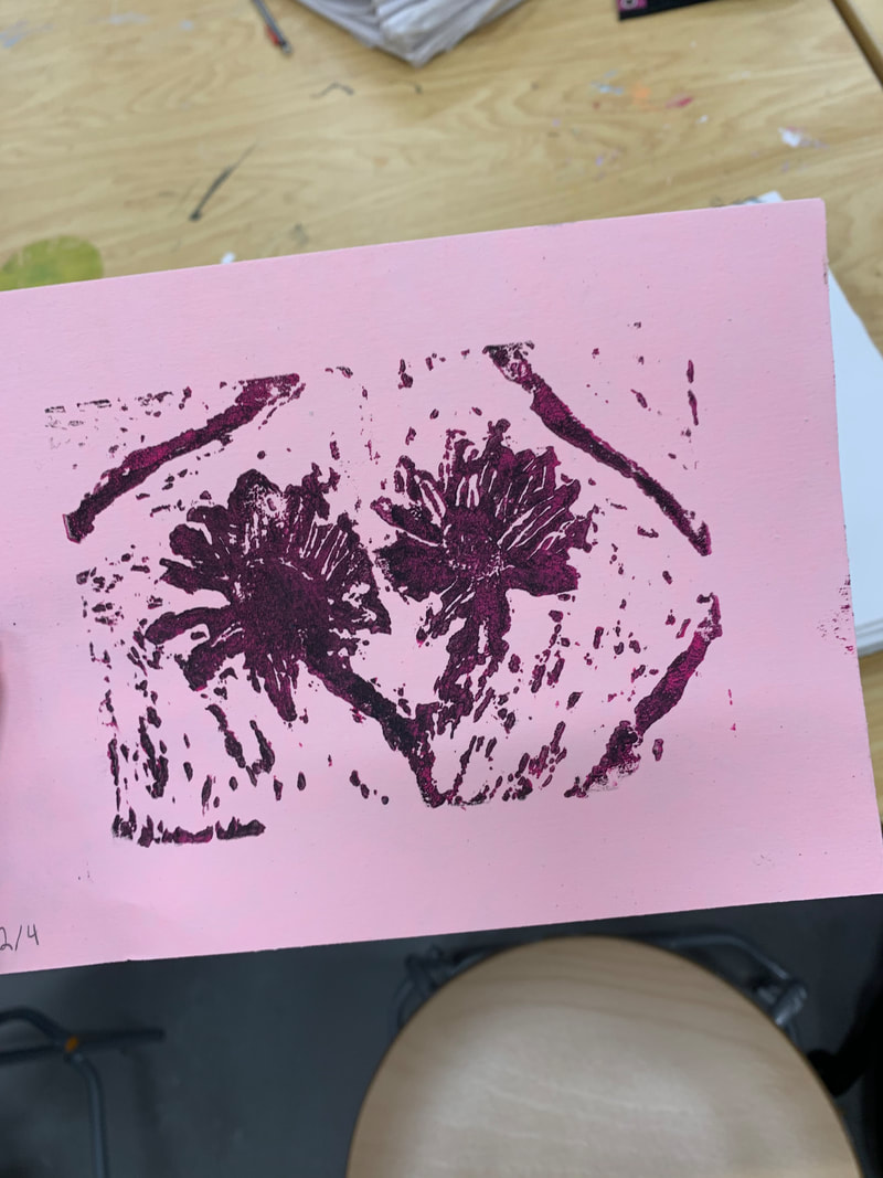 photo of llenoleum block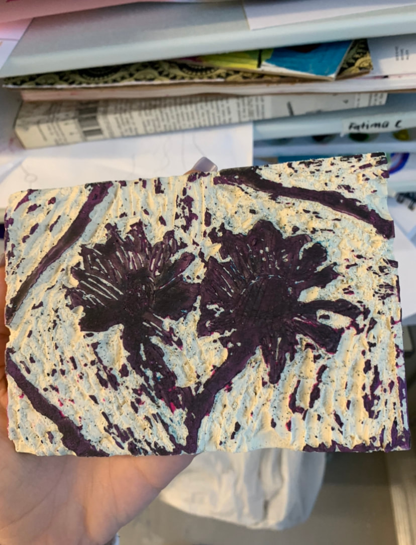 piece in progress 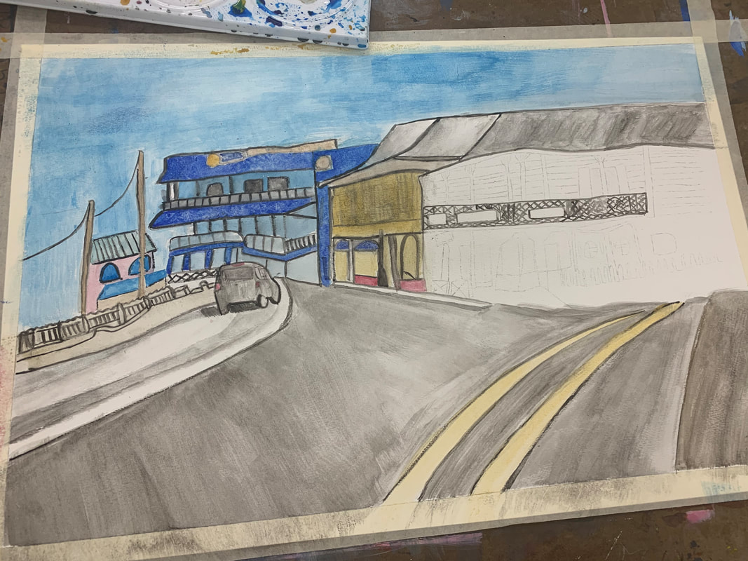 finished piece 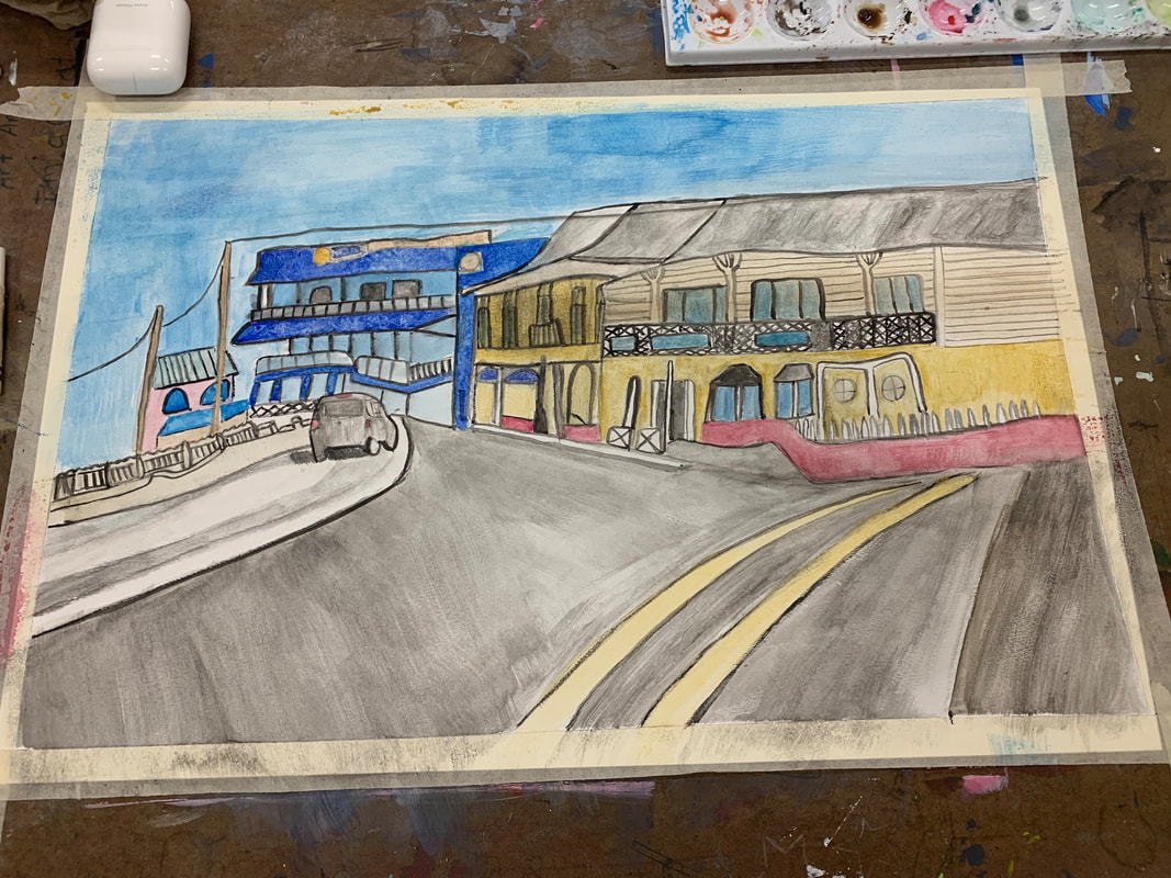 most helpful perspective warmup 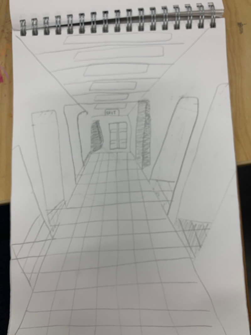 most helpful watercolor warmup which perspective i usedI used 2nd perspective where i took the photoI took this photo during spring break when me and my family took a trip to Grand Cayman Island. The trip was so great and the picture I painted was from georgetown in grand cayman. what i found difficultWhat I found difficult about this project was getting the right detail. The reference photo I chose was difficult enough but getting it to fit perspective and look realistic took many tries and was by far the most difficult part. why the warm ups were most helpfulThe hallway was helpful because it helped me focus on perspective and learn the style. The watercolor style warm up was helpful because it showed a bunch of different styles that was easy for me to look back on later on.
|
AuthorWrite something about yourself. No need to be fancy, just an overview. Archives
January 2020
Categories |
 RSS Feed
