|
children's book painting 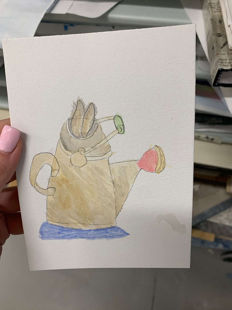 sunset 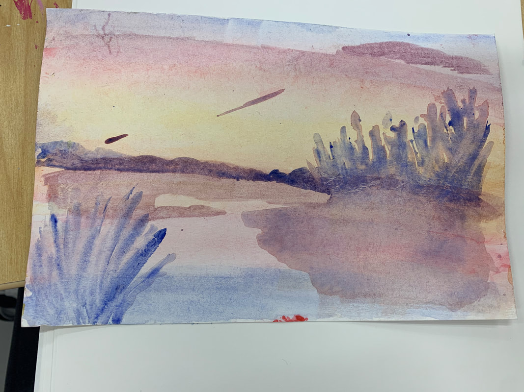 watercolor techniques 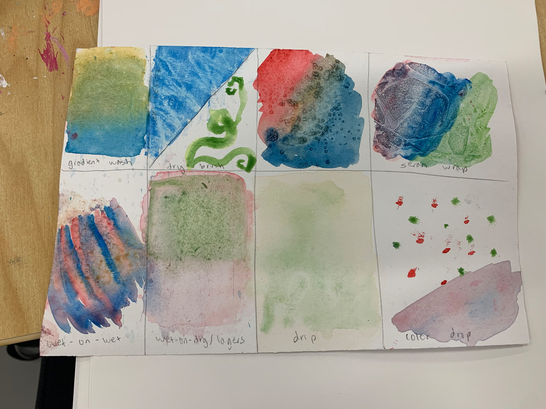 sketch of hallway 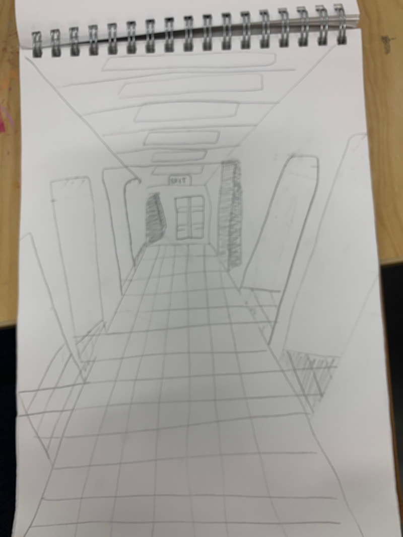 most helpful activityIn my opinion, the most helpful activity was the sketch of the hallway. This is because it really helped me focus on perspective and really making things look real and far away/close up. I focused on making objects smaller the farther they were, and bigger the closer they were. This made the painting look much more real. what i like about watercolorWhat I like about water color is the mood it sets. Water color always has a light happy pastel vibe because of the water that's involved the color ends up being. I like the style this sets on the image because it is so unique yet beautiful. what i find difficultEven though the water sets a cool tone on a painting it makes it difficult to paint. This is because unlike acrylic, when you mess up with water color it is much more difficult to cover it up because of how light the paint is. It is also difficult to decide how much water you are using and be careful because too much water/too little can ruin your piece.
0 Comments
painting in progress 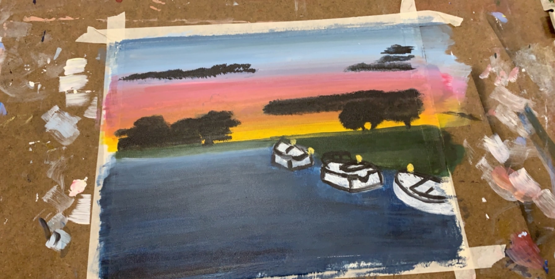 finished piece 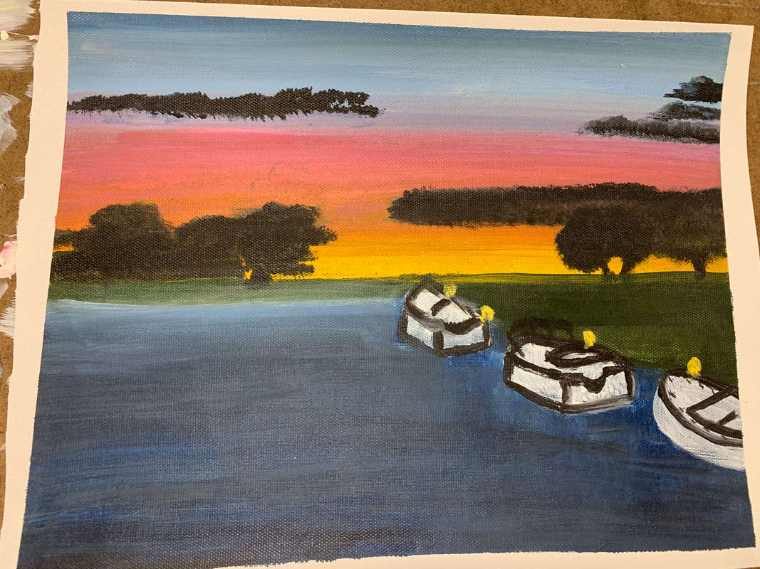 most helpful warmupThe most helpful warmup in my opinion was the acrylic painting sphere. This is because we had already done the sphere with charcoal but doing it with paint was a whole new aspect. This is because with charcoal it was easy to fade and make shadows but with paint it was challenging. Over time I got the hang of it and this warmup helped me a lot with my piece. placeThe place that I am representing in my piece is the harbor at pine knoll shores. This was over the summer and I went to the beach with my friends. It was so much fun and such a great memory, that special and beautiful night with the sunset is what I like to think of every time I see that photo and that is what I wanted to capture in my piece. most challengingThe most challenging part of my piece in my opinion was the water. This is because of 2 aspects, the color of the water and the way the light reflects off of it. The picture I took was right when the sun was setting so part of the water was light and shimmery because the sun was reflecting off of it and it was so detailed to it was hard to recreate. The color was hard because I had to mix so many different greys and blues to get it just right. most successfulI feel the most successful part of my piece was the sunset. This is because of the way each color faded into each other made the painting look realistic. I also redid the sunset 3 times to get it just right and I feel as though I captured it well and I'm happy with the way it turned out. processI started off my piece with the sunset and the water. After I let those dry, I continued with the objects like the trees and village, as well as the boats. The boats was a little bit of a struggle because my painting looked so real and the boats made it look cartoon, so that is the only thing I don't like about my painting. Once I finished the boats I touched everything up by using tape along the straight edges.
painting a tree: 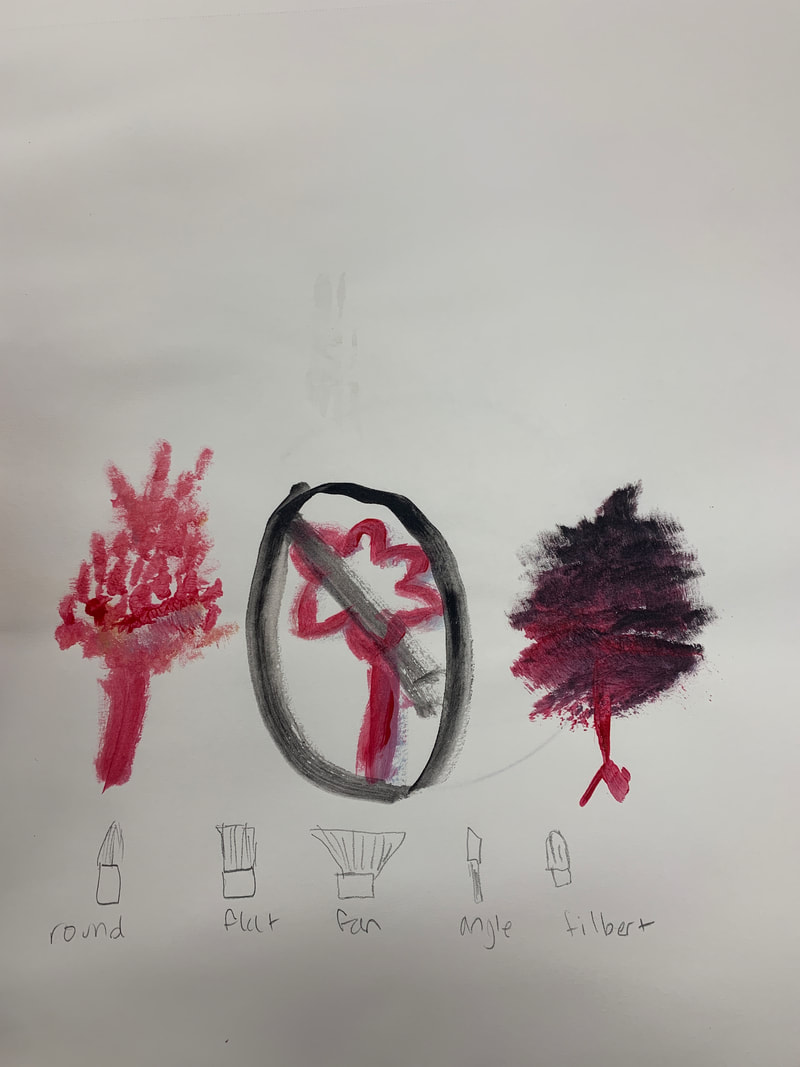 skin tones: 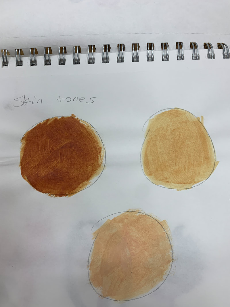 color matching 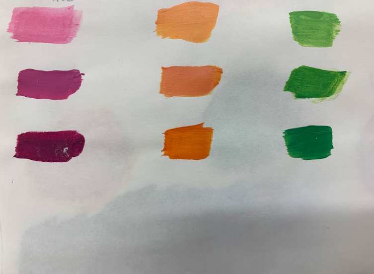 tint/shade/tone 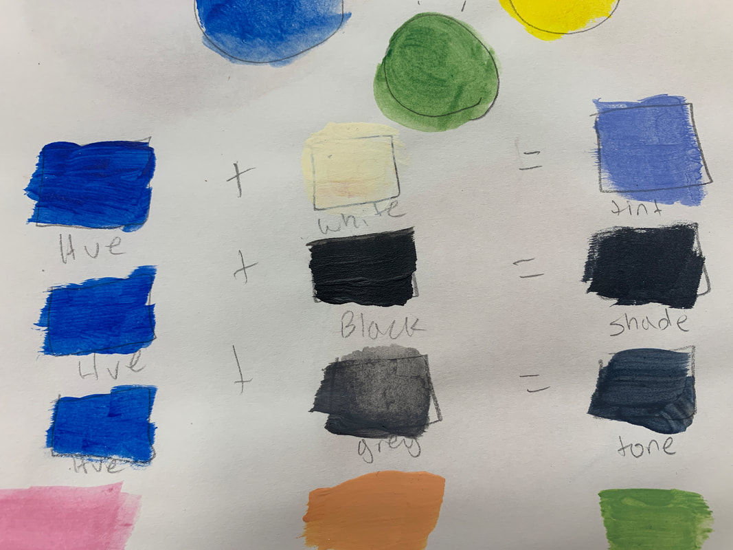 color wheel 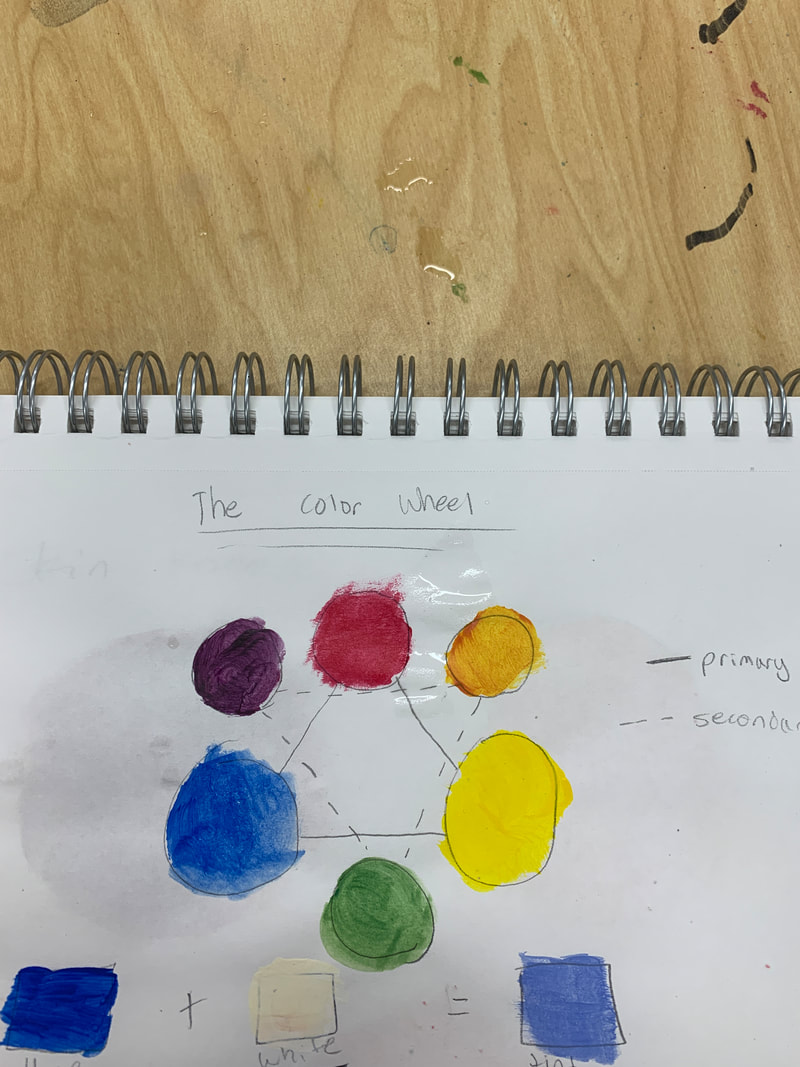 textures/gradient of a color 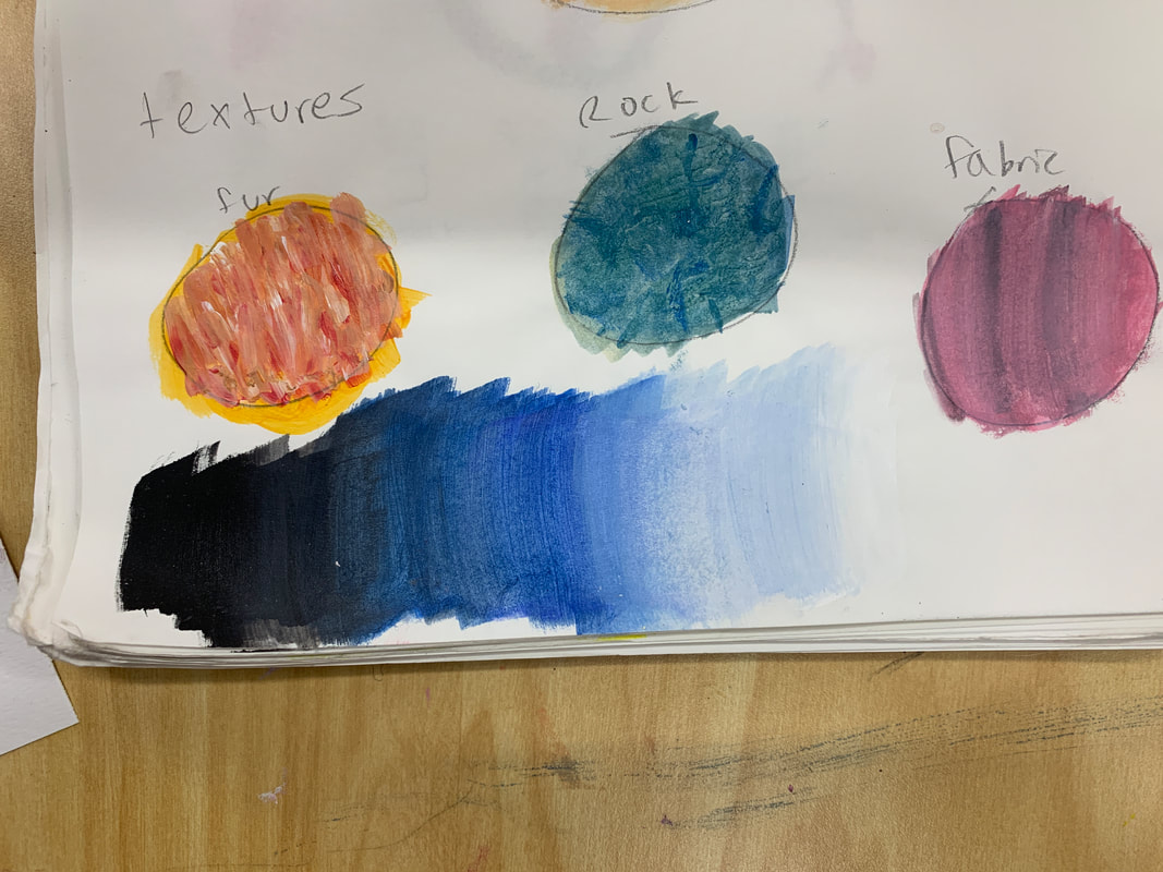 what i learnedFrom these activities I learned that there are so many different things that you can do to a color to make it look a certain way. It all depends on brush strokes, the way you mix, and the amount you add. You can make a simple color like red appear as detailed fur on an animal with the way you work with it. the most helpfulI feel like gradient fade was the most helpful. This is because I planned and painted a sunset. The gradient fade made my sky look extremely beautiful and realistic. I am thankful to have learned that skill because my painting would not have looked the same without it. The warmup i learned the most fromI learned the most from the color wheel. This is because the color wheel shows how you can mix certain primary colors to make those secondary colors. This was helpful because when I was painting I could look back at my color wheel to see how I could mix 2 colors to get a certain color. It was very helpful and it helped my painting turn out successful. ways to make brownA way to make brown is by starting with an orange. You could get this color by mixing yellow and red, Once you have created the orange, add a tint of black the more depending how dark you would like it. If it looks too dark then add some white. Another way could be starting with a black and adding white to make grey. You could then add some red to get a brown tint. How to tone down a colorTo tone down a color you could add a tint of grey. This would make the color much more dull and less vibrant. For example if you had a vibrant blue then adding a tint of grey would tone down the blue by making it less bright. Adding white could also tone down a color by making it lighter and more pastel.
pen drawing: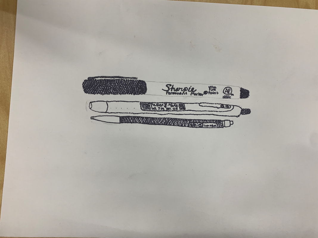 Charcoal Drawing pencil drawing most helpful warmup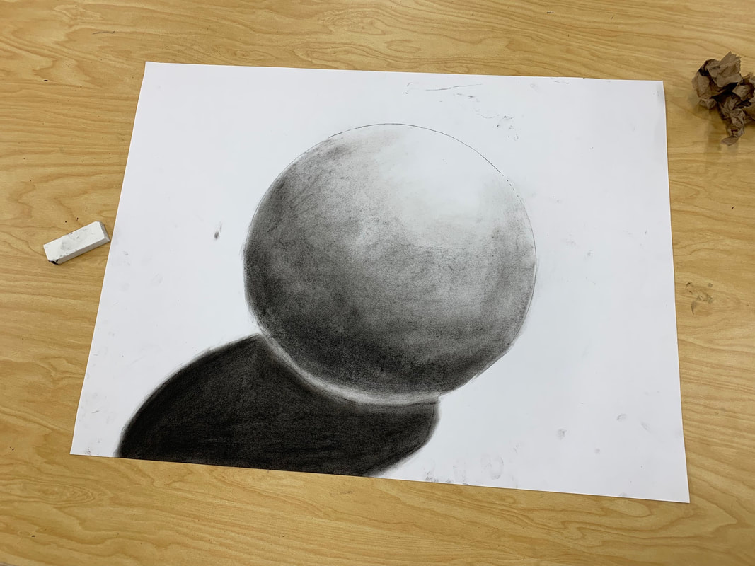 The most helpful warmup in my option was the sphere drawing. This is because the different shading of the charcoal added such a depth and value that I never thought it could add! This helped me learn why value is so important in a drawing because it makes it feel so real. The sphere looked so much more 3-d not just because of its shadow but the way the charcoal shading made it looked like the light bounced off of it. composition: the placement or arrangement of visual elements or 'ingredients' in a work of art value: the relative lightness or darkness of a color charcoal pros - great at adding value - super easy to draw with charcoal cons - messy - can be too dark pencil pros - erasable - good for value - easy to add detail pencil cons - needs to be sharpened regularly - can smudge easily pen pros
- easy to shade - good for adding detail - good for styles like stippling or random line pen cons - not enough value - smears Emmanuelle Moureaux www.emmanuellemoureaux.com/all#/creche-ropponmatsu/ Emmanuelle was born in france in 1971. She has created the style of Shikiri wich means dividing space with colors. She used colors as 3 dimensional objects to divide her spaces just like layers. She ranges from art, design, and architecture and wants for her creations to give off emotions. She uses many colors and materials in her creations, one of her more popular pieces, she hung 140,000 pieces of color from the ceiling to create rainbow passageways in celebration of a Japenese soft drink. The reason Emmanuelle inspires me is because first of all her pieces are so pleasing to look at, I could never get bored with her artwork because they all have so much color. Another thing is that she creates emotion with the colors she uses . She will make each seat in a room a different color and even though it is quite simple, it is still beautiful and so put together at the same time. 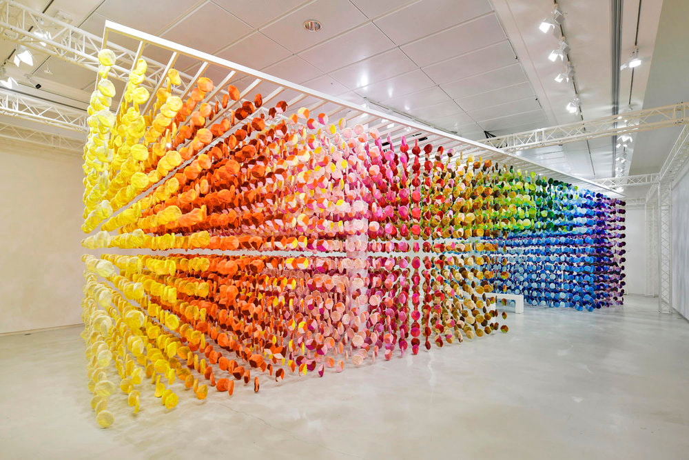 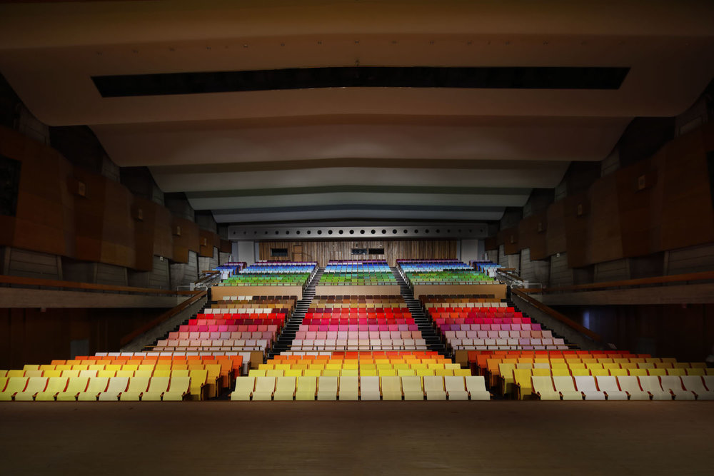 |
AuthorWrite something about yourself. No need to be fancy, just an overview. Archives
January 2020
Categories |
 RSS Feed
